Mobile has taken over the web and will continue to push desktop browsing into history. This means that if web businesses don’t adapt soon, they’ll get pushed out too. The consumerization of technology and rise of mobile adoption in emerging and established markets have driven companies to invest enormous capital and resources into pursuing the best possible mobile experience for all of their end users.
Mobile visitors are brutal and impatient, this fact gets forgotten way too often. Also, mobile visitors tend to show higher rates of engagement than desktop users. The window of engagement time is also shorter which means you need to step up.
Book a demo today to see GlobalDots is action.
Optimize cloud costs, control spend, and automate for deeper insights and efficiency.

Many organizations offer mobile websites as well as mobile apps to their end users in addition to the more conventional channels. This strategy is sound – mobile websites are usually intended to reach broad audiences by providing more exposure to help acquire net-new customers, whereas mobile apps are the best way to engage with the existing customer base to strengthen brand loyalty via richer experiences. App users frequently have a positive perception of a brand which prompted them to download the app in the first place — as a result, these users also expect richer and more engaging user experiences.
The staggering pace of progress in mobile technology poses new challenges. The overwhelming diversity of smartphones and tablets, variety of operating systems, and many different browser alternatives (each offering a different set of capabilities) coupled with multiple connectivity scenarios make delivering optimal mobile experiences consistently to all end users particularly challenging.
The increase in mobile use has not happened without some setbacks and growing pains, but that’s a normal part of the process. Sites designed for desktop users are often difficult for mobile users to utilize requiring pinching and zooming which leads to poor customer experience.
New practices are being thought on a daily basis to increase mobile experience and usability, and mobile is expected to outgrow desktop soon.
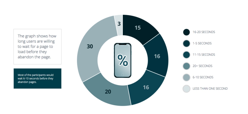
Another issue that’s been setting back mobile is the high network latency (the time delay between requests and responses). The impact of high latency was huge, resulting in extremely slow load times that always lead to high bounce rates and poor conversion. Mobile users are 15% more likely to have a dissatisfying experience than desktop users, and are least likely to return to a website where they had a dissatisfying experience.
Businesses cannot afford to deliver disappointing mobile experiences; they must capitalize on the mobile opportunity by satisfying the rising expectations of today’s users.
The challenges
Slow response times can be detrimental to the adoption of mobile apps. A delay of only several seconds is enough to make some users abandon an app. With mobile apps that employees depend on to complete their jobs, slow load times can diminish productivity and lead to employee frustration and customer dissatisfaction.
Mobile apps, unlike desktop applications, have limited resources, such as battery life, processing speed, and bandwidth use, and UI/UX design decisions need to account for this. Fortunately, some tricks and adjustments to the application programming interfaces (APIs) that often provide data to mobile applications can help improve load times while being attentive to resource consumption.
The mobile “last mile” confounds many efforts to deliver the best mobile experience possible that includes slow networks, unreliable connections, diverse devices, and limited hardware. All of these factors result in end- user interactions that don’t measure up to expectations as compared with a traditional desktop experience.
Limited connectivity hinder mobile web and mobile app experiences
Mobile sites and applications must overcome first- and middle-mile bottlenecks, just as traditional websites do for desktop clients. However, mobile sites and apps are also subject to additional connectivity challenges in the last mile (between a CDN edge and the user) that are far more difficult to surmount.
Consider the following :
- Mobile connections are four times slower on average than a standard desktop landline.
- Roughly half of mobile users report speeds of less than 4 Mbps which can decrease content access and increase end-user frustrations.
- Mobile network throughput can be unpredictable, even when connecting via WiFi.
- Mobile connection speeds vary from country to country , making it extremely difficult to ensure consistent user experiences around the world.
As a result, last-mile connections frequently result in poor end-user experiences due to high latency (i.e., the time delay involved in sending a packet across the network from the mobile device to the data center and back) and packet loss.
Traditional Web CDNs mostly focus on the first mile (the distance between the origin server and closest CDN server) and the middle mile (the distance between the two CDN edge servers), but they ignore the last mobile mile (the distance between the user and the edge server).
Back in the day, the “middle mile” was considered the slowest (with high latency between servers), but over the past decade and thanks to major infrastructure improvements, this is no longer the case. The major rise in mobile usage shifted latency to the last mobile mile, and in many geographies we measure an average latency of over 100 milliseconds. The challenge of content acceleration over mobile networks has become the most significant one for mobile apps.
There are several ways to counter this issue.
Reduce the client-side processing by keeping the JavaScript to a minimum. For instance, Starbucks’ website takes 3.53 seconds to load via Chrome with JavaScript disabled on a solid broadband connection on desktop. With JavaScript enabled, it takes 4.73 seconds, which is a 34% increase. The loading time would’ve been greater on a smartphone due to the devices’ smaller CPU, memory and cache. The moral of the story: keep the JavaScript to a minimum, or don’t use it at all. Before using a JavaScript framework, consider whether it’s really necessary. In some cases, using small bits of JavaScript is more efficient than initiating calls to a framework.
Avoid widgets. What is a “Web Widget”? A web widget is a small helpful software program embedded directly into a web page, it just occupies a portion of a webpage and does something useful with information fetched from other websites and displayed in place. Widgets can have a horrible impact on real loading time, causing an average 0.9 second delay.
Don’t forget to test your website on multiple devices. A fast load time on any given android or mobile device is the ultimate green light for your website load time efficiency.
If you want to have a satisfied mobile-device user base, optimize your website to a 4 second load time or less. You can do that by minimizing the processing load on smartphones which means cutting down on JavaScript and optimizing the HTML, CSS and images.
Poor user experience due to device limitations
The broad range of devices available to mobile users has created great opportunity for application and mobile web developers. While the very newest devices available offer increased screen sizes, greater RAM, and increased CPU cores, many devices still suffer from screen-size limitations as well as processor and memory constraints that can hinder page rendering speed and the performance of web-connected mobile applications.
Design is alto a huge part of the experience; it goes hand in hand with the technology that drives mobile apps and pages. Being able to code high-performance user experience is truly an art these days, it requires strong knowledge of front-end coding and great understanding of the mechanism behind the design. Everything affects everything: the layout, graphics, animation and images will have performance implications.
There are two important things to be considered:
- Smart loading – smart-loading mechanisms, such as lazy loading, first load visible content and then move on to content below the fold, reducing the user’s waiting time and making the ride more smooth
- Background loading – Performance depends on whether the background is one large image, an amalgamation of small tiles or a pure algorithm. In most cases, the best solution depends on the situation at hand
The perception of performance is key.
Device fragmentation complicates content delivery
Consumers access content from over 24,000 different types of devices a day: a number that will continue to increase in the coming years. The wide variance of mobile device capabilities poses additional complications to mobile delivery.
The sheer number of mobile browsers available further compounds the device diversity challenge. In addition to the “big four” browsers (Chrome, Safari, Firefox, and Internet Explorer), users access content from over 10 other browsers, each with its own version and feature set.
Along with developing and optimizing for different operating systems, a lot of attention needs to be invested in securing full app functionality and performance on various device models and specifications.
Processing capabilities, storage capacity, battery, screen resolutions are all factors that need to be considered and tested for best app performance on different devices. The more you test and adapt to different models specifications the more likely is that your app will succeed for different user profiles. The need for cross-device testing is more pronounced within the Android ecosystem. To ensure high end performance and great device coverage consider these few tips:
- Use string resources to support different languages
- Create multiple layouts to cover different sizes and resolutions (and keep it responsive)
- Schedule and execute downloads using caching, polling and prefetching to avoid rapid battery drain on weaker/older devices
Conclusion
To capitalize on the mobile opportunity, businesses must deliver high-quality site and app experiences that consistently meet or exceed the levels of performance and responsiveness end users expect.
Fortunately, organizations no longer need to settle for mobile experiences that leave end users dissatisfied.
If you have any questions about how to effectively improve your mobile app performance, or how to implement a mobile content delivery network (CDN) and reduce costs, contact us today to help you out with your performance and security needs.


